The Big Issue logo is one of the most instantly recognisable designs in the world of social enterprise. Known for its bold red and white aesthetic, it symbolises resilience, opportunity, and a voice for the unheard. Since its creation in the early 1990s, the logo has travelled far beyond magazine covers, becoming a cultural icon associated with social change.
Logos are not just images; they are powerful branding tools that tell a story without words. The big issue logo does exactly that, reflecting a mission that has always been about more than just selling magazines. This article explores the history, evolution, and significance of the logo, alongside practical advice on where to download it in PNG, SVG, and vector formats.
The Big Issue: An Overview
The Big Issue was founded in 1991 by John Bird and Gordon Roddick as a response to the growing homelessness crisis in the United Kingdom. Its concept was simple yet powerful: provide individuals facing homelessness with the opportunity to earn a living by selling a magazine directly to the public. This model offered dignity and independence, rather than charity.
From its humble beginnings in London, the publication expanded rapidly across the UK and into countries such as Australia and South Africa. Today, The Big Issue is more than just a magazine—it is a social movement. At the heart of its identity sits the big issue logo, which has helped amplify its message and ensure instant recognition among millions of people.
The Big Issue Logo History and Evolution
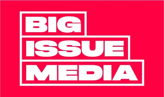
When the magazine first launched, the big issue logo was designed to stand out on the busy streets where vendors sold their copies. Its original form featured strong block lettering in white against a red background, a combination chosen for maximum visibility and emotional impact. The logo needed to be bold, eye-catching, and easy to recognise at a glance.
As the years passed, the logo evolved but never strayed far from its roots. A significant rebrand was introduced during the UK’s cost of living crisis, modernising the typography while retaining its unmistakable style. This careful balance between evolution and consistency ensured the big issue logo continued to feel both fresh and familiar, maintaining its authority in an ever-changing media landscape.
The Big Issue Logo Design Elements

Typography is a defining feature of the big issue logo. The heavy, block-style letters project confidence and urgency, qualities that align with the magazine’s role as a platform for hard-hitting journalism and social issues. The design’s simplicity also ensures clarity, making it easy for vendors to display and for customers to recognise even from a distance.
Colour is equally vital. Red conveys energy, urgency, and action, while white symbolises openness, transparency, and honesty. These shades combine to reinforce the values of The Big Issue—strength, trust, and hope. The rectangular framing around the text further enhances the logo’s impact, giving it structure and a sense of authority that matches the seriousness of the issues it addresses.
The Big Issue Logo PNG, SVG, and Vector Files
For those seeking to use the big issue logo in digital or design projects, format matters. PNG files are ideal for websites, social media, or presentations because they support transparent backgrounds. SVG and vector files, on the other hand, are perfect for larger applications such as banners, posters, or merchandise, since they can be scaled without losing quality.
Resources like Wikimedia Commons, Seeklogo, and other branding libraries often provide access to these formats. However, while the big issue logo may be publicly available in certain forms, it remains the intellectual property of The Big Issue. Any use should respect copyright and licensing requirements, ensuring that the logo is never misrepresented or used for commercial purposes without permission.
The Big Issue Logo in Popular Culture
The logo has become more than a branding device—it is a cultural touchstone. Through merchandise like tote bags, T-shirts, and mugs available from The Big Issue Shop, the big issue logo spreads awareness while raising funds to support the organisation’s mission. Each item purchased carries not only a product but also a story of empowerment and social good.
Interestingly, the big issue logo often appears alongside other “issue” logos in search results. Terms such as skill issue logo, hot issue logo from the K-pop world, or even oakley standard issue logo demonstrate how the word “issue” has been adapted in various industries. Despite this, The Big Issue stands apart, as its logo is rooted in activism and community rather than commerce or entertainment.
Branding Lessons from The Big Issue Logo
One of the clearest lessons from the big issue logo is the value of simplicity. By avoiding overly complex shapes or abstract elements, the logo maintains its clarity and ensures recognition across all formats. For charities and businesses alike, this demonstrates how a strong, minimalist design can convey powerful messages without relying on elaborate visuals.
Consistency is another crucial takeaway. Over more than three decades, the big issue logo has remained faithful to its original form, evolving only when necessary. This has built trust and loyalty among its audience. A brand identity that stands the test of time not only ensures familiarity but also strengthens the organisation’s values in the eyes of the public.
Conclusion
The big issue logo is more than just a visual symbol; it is a representation of a mission to tackle homelessness and poverty with dignity and determination. Its bold design, consistent evolution, and presence across print, digital, and merchandise have made it a key part of the organisation’s identity and its success story.
Whether you are studying its history, exploring its design elements, or seeking PNG and SVG downloads, the big issue logo stands as an example of how a brand can inspire and empower. It continues to carry the weight of a social mission while reminding us that design, when used with purpose, can drive real change.
FAQs about The Big Issue Logo
What does The Big Issue logo represent?
It represents the values of The Big Issue—empowerment, opportunity, and social justice—while serving as a bold and memorable brand identity.
Where can I download The Big Issue logo PNG or SVG?
Free versions are available on Wikimedia Commons and branding resource websites, though usage should follow copyright guidelines.
Is The Big Issue logo copyrighted?
Yes, it is protected by copyright. Any commercial use should be approved by The Big Issue organisation.
Has The Big Issue logo changed over time?
Yes, the logo has evolved through rebrands, but it has always retained its iconic red and white block design.
Why is The Big Issue logo designed in red and white?
Red conveys urgency and strength, while white symbolises honesty and openness—qualities that reflect the mission of the organisation.
You may also read:

